My team was tasked to implement a new brand direction for the website.
The new brand direction gave us an opportunity to redo the complete site structure.
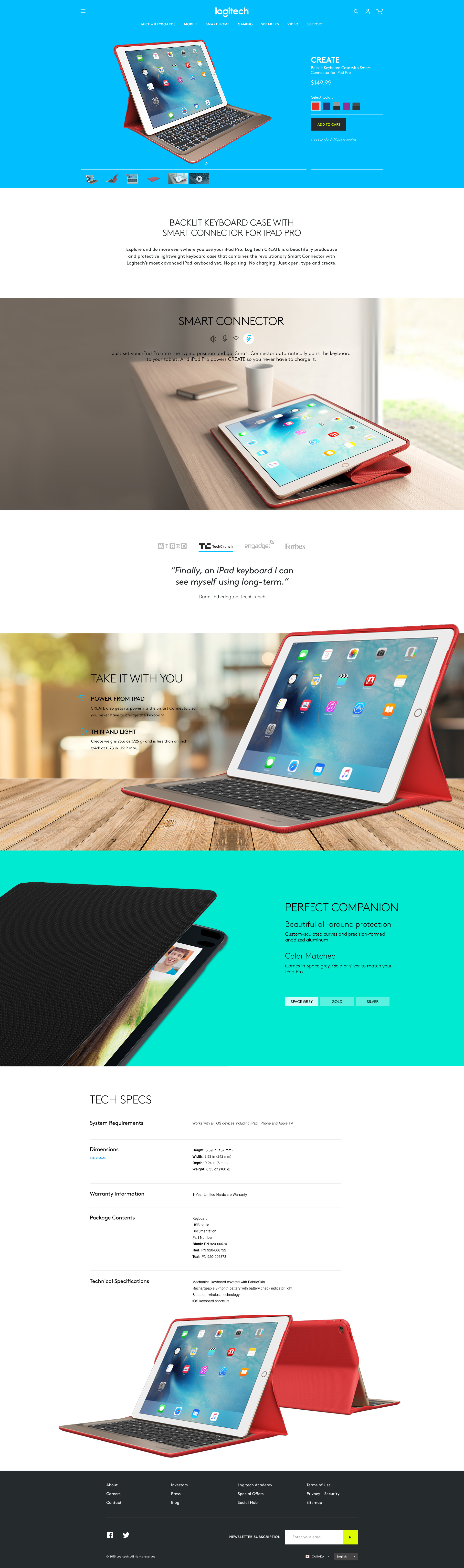
A new site with a better shopping experience. Larger imagery, highlighted features and benefits. Blocks of color alternate, so the information is shown to the viewer in a clean and simple way.
Role: Art Director, UX
Basic page
2nd tier products uses a simpler page with less hero type images. Still gets a nice hero shot, features are text only, but has spacing to easily read content.